FINE drops its first collection in minimalist style
FINE is a groundbreaking skincare brand, specifically tailored to nurture aging skin. Powered by scientifically validated active ingredients, FINE seeks to empower individuals with real skin concerns to aim for skin health instead of chasing the elusive fountain of youth. In the face of stiff competition in the beauty sector, FINE recognized the need for standout packaging capable of resonating with elder millennials across the gender spectrum.
The Problem:
In the dynamic landscape of the beauty industry, competition has reached an all-time high. FINE was confronted with the task of carving out a distinct visual identity in this saturated market. Our challenge was to aid FINE in conceptualizing a brand image that would not only be instantly recognizable but also concentrate on the efficacy of active ingredients and their outcomes. Furthermore, it was crucial to align this identity with the aesthetic preferences of a generation who are maturing gracefully, embracing the natural process of aging.
OUR solution:
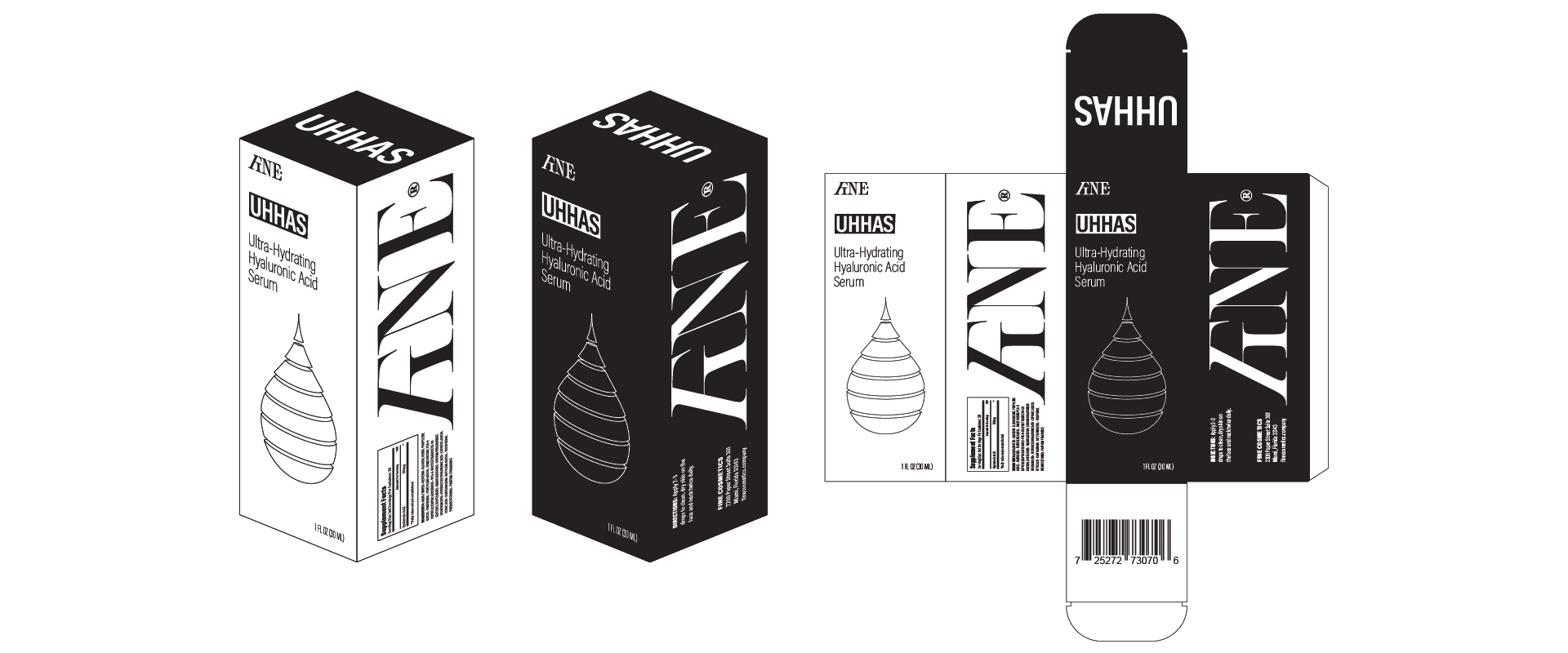
OBLIQUE partnered with FINE to cultivate a unique brand identity, develop an Instagram-friendly packaging format, and establish a sophisticated, polished aesthetic.
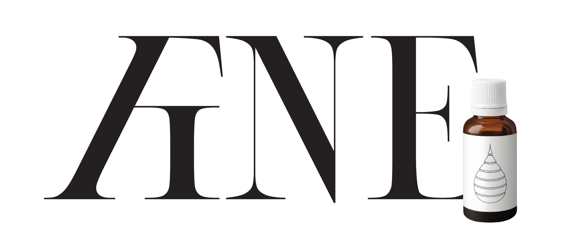
We conceptualized a logo centered on a distinct, proprietary "FI" ligature that not only commands a double-take but also ensures a standout presence. Reflecting the principles of classic type design, the logo cleverly employs interpolation to adjust the hairlines for optimum legibility at various optical sizes.
The package's high-contrast design effectively works in both positive and negative forms. The compelling interplay of light and dark elements not only gives the packaging a distinctive and memorable look but also enhances shelf visibility in a retail environment. This duality of design, implemented strategically, amplifies the product's appeal to consumers, ultimately driving increased sales and enhancing brand recognition.


